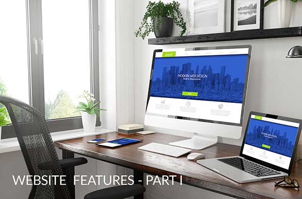
There are some features a professional business website shouldn’t go without. If you want to stand out, build audience, and convert your visitors into customers, there are some elements you’re going to want to ensure are included in your site’s design and marketing.
What is a professional website?
A professionally build website is a well-designed, user-friendly, and strategically structured online platform that effectively represents a business, brand, or individual. It is characterized by: Aesthetic and Functional Design, Clear Branding and Messaging, Optimized User Experience (UX), Quality Content, Search Engine Optimization (SEO), Security and Reliability and Strong Call-to-Action (CTA).
A professional website not only looks visually appealing but also builds trust, credibility, and engagement while achieving its intended goals.
Easy-to-use user interface
User interface is the first thing any website should prioritize. Images, videos, text, and graphics should be clearly represented in your site’s visual design. From a graphic design standpoint, the way a business website presents its navigational interface is among the first things a visitor will notice so you must make it count. Any site which crams in detail and does not pay attention to how it presents to the audience is going to lose their leads. Establish clear space between elements, keep site presentation accurate to what a visitor is expecting, and always verify your presentation is clear.

Easy-to-use navigation
After you have your site’s graphic appearance optimized, the next feature you want to look at involves how users are moving from page to page. Information should be easy to locate, switching between pages should be straightforward, your header should contain categories and potentially sub-categories of links to other site pages, and a site map should be accessible somewhere on your home page. If a visitor arrives and they don’t have to put in much effort finding what they came there to view, that works in your favor. Ideally, you want to make sure navigation is a fluid experience.
A clear message on the home page
The quality of your home page determines whether a visitor will continue perusing your professional website or not. Your home should include strategically placed images or photos, eye-catching headlines, engaging text, and should clearly communicate your company’s brand and purpose. From the colors you choose to the tone of language, every aspect of your home page should be direct in asserting your identity. You want there to be no confusion regarding what types of services you offer and what your business is about. The more clearly you communicate your brand, the faster you engage the user which could lead to an instant sale.
A strong call-to-action
Across your home page, landing pages, and any page you’re using as a means to attract visitors, you want a strong call-to-action, or CTA for short. A call-to-action can appear in text or image format, although for most businesses, text is preferred. A CTA will indicate to your audience the expected action you expect them to take. This action could mean sending an email or making a phone call to receive a free estimate or for a consult. Your CTA could also mean buying a product directly off site, signing up for an email newsletter, following your brand on social media, or some sort of other participatory move.
Engaging, informative content
The best business websites are those that focus on delivering engaging, high quality, and informative content. Surely, your company has something unique going for it. Highlight that! No one wants to buy products or services, or hire a company whose services or website mirrors that of the competition. Don’t be afraid to be bold in sharing what’s different about your brand and why you stand out. Also, the closer you know your audience, the better you can tailor content towards them in the most engaging and informational way. Get to know the customer you’re chasing. When you can figure out what matters to them and what questions they have, from there you can build relevant content to match.
If you’re looking to build a professional website for your business or organization, get in touch with New Concept Design. As a full-service web design company in London, Ontario, we can help in creating the perfect website customized to your customers. Services include web development, graphic design and printing, hosting, e-mail exchange hosting, mobile app design, and SEO.
